Creating Custom Charts
improve this page | report issueOverview
Custom charts allow you to visualize the collected analytics data in your analytics data store as charts that are not available by default in the MobileFirst Analytics Console. This visualization feature is a powerful way to analyze business-critical data.
Available custom chart types: App Session, Network Transactions, Push Notifications, Client Logs, Server Logs, Custom Data.
Jump to
- Creating a custom chart
- Chart types
- Creating custom charts for client logs
- Exporting custom chart data
- Exporting and importing custom chart definitions
Creating a custom chart
In the MobileFirst Analytics Console, from the Dashboard panel, the custom charts creation builder takes you through four main stages:
1. General settings
Click the Create Chart button in the Custom Charts tab.
In the General Settings tab, select Chart Title, Event Type and the Chart Type.
After selecting the Event Type and Chart Type, the Chart Definition tab appears.
2. The Chart Definition tab
Use the Chart Definition tab to define the chart for the specified chart type that you previously selected. After you define the chart, you can set the chart filters and chart properties.
3. The Chart Filters tab
Chart Filters are used to fine-tune the custom chart. Multiple filters can be defined for any chart.
For example, if you are interested in seeing the average app session duration for a particular app, you can specify the following options:
- Select Application Name for Property.
- Select Equals for Operator.
- Select the name of your app for Value.
- Click Add Filter.
The app name filter is added to the table of filters for your chart.
4. Chart properties
Chart properties are available for the Table, Bar Graph, and Line Graph chart types. The goal of chart properties is to enhance how the data is presented so that the visualization is more effective.
If you created a Table chart, the chart properties can be set to define the table page size, the field on which to sort, and the sort order of the field.
If you created a Bar Graph or Line Graph chart, the chart properties can be set to label threshold lines to add a frame of reference for anyone who is monitoring the chart.
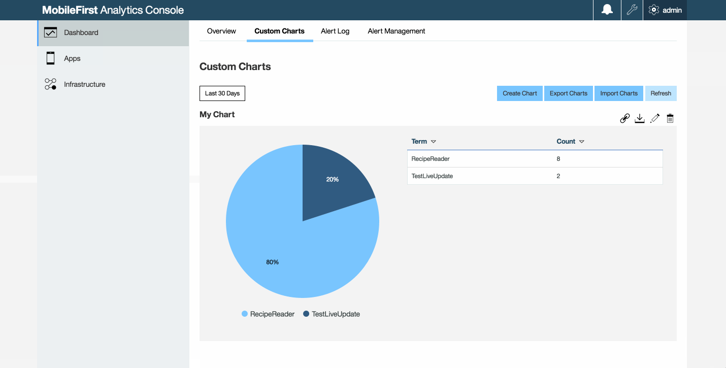
Chart types
Bar graph
The bar graph allows for visualization of numeric data over an X-axis. When you define a bar graph, you must choose the value for X-Axis first. You can choose from the following possible values.
- Timeline - choose Timeline for X-Axis if you want to see your data as a trend (for example, average app session duration over time).
- Property - choose Property if you want to see a count breakdown for the specific property. If you choose Property for X-Axis, then Total is implicitly chosen for Y-Axis. For example, choose Property for X-Axis and Application Name for Property to see a count for a specified event type, which is broken down by app name.
After you define a value for X-Axis, you can define a value for Y-Axis. If you choose Timeline for X-Axis, you can choose the following possible values for Y-Axis.
- Average - averages a numeric property in the supplied event type.
- Total - a total count of a property in the supplied event type.
- Unique - a unique count of a property in the supplied event type.
After you define the chart axes, you must choose a value for Property.
Line graph
The line graph allows for the visualization of some metric over time. This type of chart is valuable when you want to visualize data in terms of a trend over time. The first value to define when you create a line graph is Measure, which has the following possible values.
- Average - averages a numeric property in the supplied event type.
- Total - a total count of a property in the supplied event type.
- Unique - a unique count of a property in the supplied event type.
After you define the measurement, you must choose a value for Property.
Flow chart
The flow chart allows for the visualization of flow breakdown of one property to another. For a flow chart, the following properties must be set.
- Source - the value of a source node in the diagram.
- Destination - the value of the destination node in the diagram.
- Property - a property value from either the source node or the destination node.
With the flow chart, you can see the density breakdown of various sources that flow to a destination, or vice versa. For example, if you want to see the breakdown of log severities for an app, you can define the following values.
- Select Application Name for Source.
- Select Log Level for Destination.
- Select the name of your app for Property.
Metric group
The metric group can be used to visualize a single metric that is measured as either an average value, a total count, or a unique count. To define a metric group, you must define one of the following possible values for Measure.
- Average - averages a numeric property in the supplied event type.
- Total - a total count of a property in the supplied event type.
- Unique - a unique count of a property in the supplied event type.
After you define the measurement, you must choose a value for Property. This metric is displayed in the metric group.
Pie chart
The pie chart can be used to visualize the count breakdown of values for a particular property. For example, if you want to see a crash breakdown, define the following values.
- Select App Session for Event Type.
- Select Pie Chart for Chart Type.
- Select Closed By for Property.
The resulting pie chart shows the breakdown of app sessions that were closed by the user as opposed to app sessions that were closed by a crash.
Table
The table is useful when you want to see the raw data. Building a table is as simple as adding columns for the raw data that you want to see.
Because not all properties are required for specific event types, null values can appear in your table. If you want to prevent these rows from appearing in your table, add an Exists filter for a specific property in the Chart Filters tab.
Creating custom charts for client logs
You can create a custom chart for client logs that contain log information that is sent with the platform’s Logger API.
The log information also includes contextual information about the device, including environment, app name, and app version.
Note: You must log custom events to populate custom charts. For information on sending custom events from the client app, see Capturing custom data.
- From the client app, populate the data by sending captured logs to the server. See Sending captured logs.
- In the MobileFirst Analytics Console, click the Custom Charts tab and continue to a create a chart:
- Chart Title: Application and Log Levels
- Event Type: Client Logs
- Chart Type: Flow Chart
- Click the Chart Definition tab and provide the following values:
- Source: Application Name
- Destination: Log Level
- Property: your app name
- Click the Save button.
Exporting custom chart data
You can download the data that is shown for any custom chart.
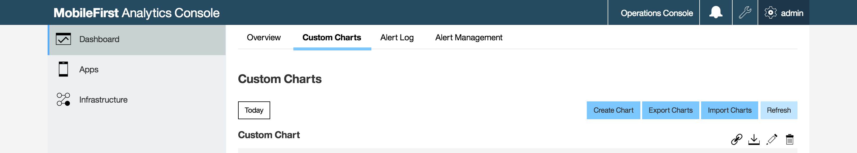
- Export with URL - looks like a chain link
- Download Chart - looks like a down arrow
- Edit Chart - looks like a pencil
- Delete Chart - looks like a trash can
Click the Download Chart icon to download a file in JSON format from the Analytics Console.
Click the Export with URL icon to generate an export link from the Analytics Console to call from an HTTP client. This option is useful if you want to write a script to automate the export processes on a specified time interval.
Exporting and importing custom chart definitions
You can export and import custom chart definitions in the Analytics Console. If you are moving from a test environment to a production deployment, you can save time by exporting your custom chart definitions instead of re-creating your custom charts for your new cluster.
- Click the Custom Charts tab in the Analytics Console dashboard.
- Click Export Charts to download a JSON file with your chart definition.
- Choose a location to save the JSON file.
- Click Import Charts to import your JSON file. If you import a custom chart definition that already exists, you create duplicate definitions, which also means that the Analytics Console shows duplicate custom charts.
Inclusive terminology note: The Mobile First Platform team is making changes to support the IBM® initiative to replace racially biased and other discriminatory language in our code and content with more inclusive language. While IBM values the use of inclusive language, terms that are outside of IBM's direct influence are sometimes required for the sake of maintaining user understanding. As other industry leaders join IBM in embracing the use of inclusive language, IBM will continue to update the documentation to reflect those changes.