Common UI Controls
improve this page | report issueOverview
Some controls are common to most hybrid environments, such as modal pop-up windows, loading screens, and tab bars.
With IBM MobileFirst Platform Foundation, you can use a JavaScript API to invoke these controls regardless of the environment. This API automatically renders these controls in a native way for each mobile platform.
WL.BusyIndicator
WL.BusyIndicator implements a common API to display a modal activity indicator.
It uses native implementation on the following platforms: Android, iOS, BlackBerry 10, and Windows Phone 8.
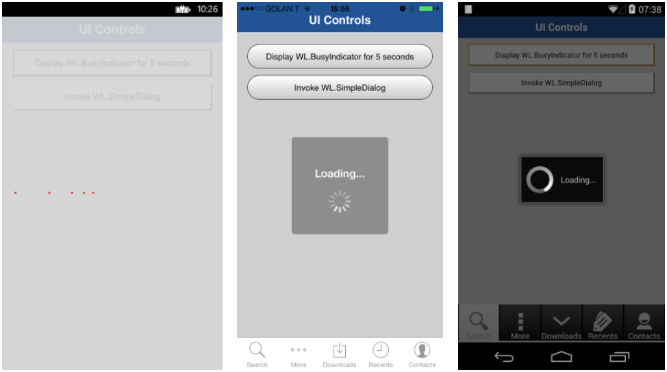
It must be initialized before use.
busyIndicator = new WL.BusyIndicator( null, {text : 'Loading...'});
The first parameter, the parent element ID for WL.BusyIndicator, is ignored in iOS, Android, Windows Phone, and BlackBerry environments. It only applies to the web environment.
For the second parameter, the available options are:
text– Sets the modal text.color– Sets the text color.fullScreen– Determines whether to display the modal message full screen (iOS only).
For more information about the options, see the MobileFirst user documentation.
WL.BusyIndicator provides the following API:
void myBusyIndicator.show()– Displays the "busy" indicator.void myBusyIndicator.hide()– Hides the "busy" indicator.boolean myBusyIndicator.isVisible()– Returns whether the busy indicator is visible.
WL.SimpleDialog
The WL.SimpleDialog implements a common API for showing a modal dialog window with buttons.
It uses a native implementation on the following platforms: Android, iOS, Windows Phone 8, and BlackBerry 10.
Adobe Air, BlackBerry 6/7, Desktop webpage, and Mobile Web use a JavaScript-based implementation.
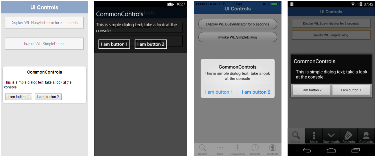
The invocation syntax is:
WL.SimpleDialog.show(title, text, buttons, options);
The parameters are title, text, and buttons as an array of button objects.
The dialog is closed when any of the buttons is pressed.
Each button object has two properties:
text– The text that displayed on the button.handler– The function to invoke if the button is pressed.
var dialogTitle = "CommonControls";
var dialogText = "This is simple dialog text; take a look at the console";
<p>WL.SimpleDialog.show(dialogTitle, dialogText, [
    {
        text : 'I am button 1',
        handler : simpleDialogButton1Click
    }, {
        text : 'I am button 2',
        handler : simpleDialogButton2Click
    }
]);
Limitations
- In Windows Phone 8, you can use at most four buttons in each instance of
WL.SimpleDialog. - In Android, you can use at most three buttons in each instance of
WL.SimpleDialog. - Only 1 SimpleDialog can be open at a time.
WL.TabBar
Wl.TabBar provides application navigation with a tab bar component.
Supported environments: Android and iOS.
The iOS implementation uses a native component, but Android uses an HTML-generated tab bar.
The syntax is similar, though with some minor differences.
WL.TabBar must be initialized before it can be used.
Because WL.TabBar is only available for Android and iOS, it is recommended to initialize it at the environment level (android\js\main.js and iphone-or-ipad\js\main.js) and not in the common folder (common\js\main.js).
Use the following syntax to add a tab bar item:
WL.TabBar.addItem(id, callback, title, options);
id– The internal reference for this tab.callback– The JavaScript function to run when a tab item is pressed.title– The text to display on the tab bar item.options– Varies between iOS and Android. See below.
iOS options
badge– The string to display on the badge of the item.image– The file name of an image to use or the native iOS button identifier:- tabButton:More
- tabButton:Favorites
- tabButton:Featured
- tabButton:TopRated
- tabButton:Recents
- tabButton:Contacts
- tabButton:History
- tabButton:Bookmarks
- tabButton:Search
- tabButton:Downloads
- tabButton:MostRecent
- tabButton:MostViewed
WL.TabBar.addItem("item1",
    function(){ alert("item 1 pressed"); },
    "Item 1",{
        image: "tabButton:Search",
        //image: "images/tabImage.png",}
);
Android options
image– The file name of an image to use for an unselected state.imageSelected– The file name of an image to use for a selected state.
WL.TabBar.addItem("item1",
    function(){ alert("item 1 pressed"); },
    "Item 1",{
    image: "images/tabImage.png",}
);
Other API signatures
WL.TabBar.init()WL.TabBar.addItem: Returns WL.TabBarItemWL.TabBar.removeAllItems: iOS onlyWL.TabBar.setParentDivId: Android onlyWL.TabBar.setVisible(true/false)WL.TabBar.setSelectedItem(itemID)WL.TabBar.setEnabled (true/false)WL.TabBarItem.setEnabled(true/false)WL.TabBarItem.updateBadge(string): iOS only
WL.OptionsMenu
Supported environments: Android 2.x, Windows 8, and Windows Phone 8.
By using WL.OptionsMenu, you can display a menu of options.
In Windows Phone 8, this also functions as a tab bar.
Note: If your application targets Android 3.0 (API level 11) or later, WL.OptionsMenu might have no effect, depending on the device. For more information, see the MobileFirst user documentation.
Because WL.OptionsMenu is only available for Android 2.x, Windows 8 and Windows Phone 8, it is recommended to initialize it at the environment level (android\js\main.js, windows8\js\main.js, windowsphone8\js\main.js) and not in the common folder (common\js\main.js).
WL.OptionsMenu must be initialized before use.
Here are the API signatures:
WL.OptionsMenu.init()WL.OptionsMenu.addItem: Returns a reference to a new options item.WL.OptionsMenu.getItem(itemID)WL.OptionsMenu.getItem(itemID).setEnabled (true/false)WL.OptionsMenu.setVisible (true/false)WL.OptionsMenu.setEnabled (true/false)WL.OptionsMenu.removeItem (itemID)WL.OptionsMenu.removeItems()
Use the following syntax to add an option of a menu:
WL.OptionsMenu.addItem(id, callbackFunction, title, options);
id– An internal reference for this menu option.callback– The JavaScript function to run when the menu option is pressed.title– The text of the menu item.options– An options object with the following properties:image– A path to a designated image, relative to the resource root directory.enabled– A Boolean value, which states whether the item is enabled or disabled.
WL.OptionsMenu.addItem("item2",
    function(){ alert("item 2 pressed");},
    "Contacts", {
    image: "contacts.png"}
);
Paths to image files must not be given; instead, place the files at the following locations:
- Android:
nativeResouces\drawable-* - Windows 8:
Resources\applicationBar - Windows Phone 8:
nativeResources\applicationBar
Splash screen
Supported environments: Android, iOS, and WP8.
The framework provides a default behavior for how the splash screen is loaded.
The splash screen is shown after the application launches. Paths:
- Android:
android\native\src\com\app-name\app-name.java - iOS:
iphone-or-ipad\native\Classes\app-name.m - Windows Phone 8:
Windowsphone8\native\App.xaml.cs
You can extend the default behavior or create a new one altogether.
Hiding the splash screen
The splash screen is hidden after the framework finishes initializing.
As mentioned, you can handle when to hide the splash screen by using MobileFirst framework. To do so:
- Uncomment the
autoHideSplashoption in theinitOptions.jsfile. - Use the following API method at the point in the JavaScript code where you want the splash screen to be hidden. For example:
function wlCommonInit() {
      WL.App.hideSplashScreen();
}
Extending the splash screen duration
If an application requires extra processing time while it launches, you can, for example, extend the splash screen duration by implementing custom JavaScript code to that effect.
This might happen when waiting for data from a back end or while loading more frameworks.
function wlCommonInit(){
    // Custom app logic...
        customLogicCallback();
}

function customLogicCallback() {
    WL.App.hideSplashScreen();
}
Redisplaying the splash screen
Similarly, the splash screen can be manually displayed again. Use the JavaScript API method:
WL.App.showSplashScreen();
This example forces a reload of the application.
function wlCommonInit() {
    WL.App.hideSplashscreen();
    // Custom app logic…
    reloadApplication();
}

function reloadApplication() {
    WL.App.showSplashScreen();
    // More custom app code…
    WL.Client.reloadApp();
}
Using a different splash screen image
By default, the splash screen that is used in a MobileFirst application is a static image.
To use a different image, replace the following with another image:
- Android:
native\res\drawable\splash.9.png - iOS:
native\Resources\Default-*.png - WP8:
native\SplashScreenImage.png
The splash screen can also be more than a static image.
A developer can implement custom code which, by extending the time the splash screen is displayed, displays an animated "loading…" screen, a short video clip, etc.
For more information about creating a custom splash screen, see the user documentation topic about managing the splash screen.
Sample application
Click to download the MobileFirst project.
▲Inclusive terminology note: The Mobile First Platform team is making changes to support the IBM® initiative to replace racially biased and other discriminatory language in our code and content with more inclusive language. While IBM values the use of inclusive language, terms that are outside of IBM's direct influence are sometimes required for the sake of maintaining user understanding. As other industry leaders join IBM in embracing the use of inclusive language, IBM will continue to update the documentation to reflect those changes.