Digital App Builder interface
improve this page | report issueDigital App Builder Interface
Based on the mode (Design/Code) selected, the Digital App Builder interface is displayed.
Digital App Builder interface in Design mode
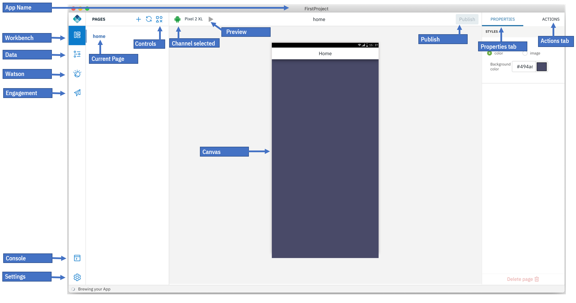
Digital App Builder interface consists of the following in the Left navigation panel:
- Workbench - displays or hides the page details
- Data - helps you to add a dataset by connecting to an existing data source or create a data source for a microservice using OpenAPI doc.
- Watson - consists of Image Recognition and Chatbot (Watson Assistant) components for configuring an existing instance or create a new instance.
- Engagement - You can increase your user engagement with the app by adding Push notifications services and use Live Update feature to show/hide controls and pages or change their properties when your app is live.
- Console: displays the console to see the activities.
- Settings: displays the App details, Server info, Plugins, and Repair Project (like Rebuilding dependencies, Rebuilding platforms, Resetting IBM Cloud credentials), enable or disable analytics.
Workbench
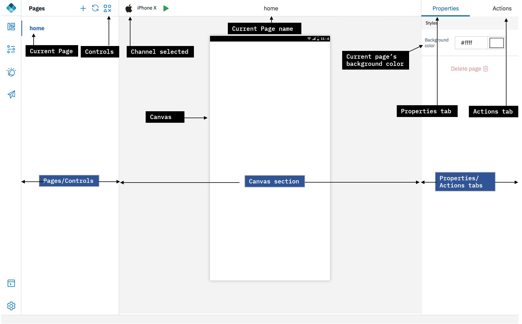
Workbench helps you to design the pages. Workbench consists of three work areas:
-
Pages/Controls: This area displays the name of the pages created by default. Use + sign to create a new page. On clicking Controls icon, displays controls that helps in adding functionality to a page in an app. You can drag and drop the controls from the respective Controls pallette to a page’s canvas. Each control has a set of properties and actions. You can modify the properties of each of the controls selected.
Following is the list of controls provided available:
-
Basic: You can drag-and-drop these basic controls (Button, Heading, Image, and Label) to the canvas and configure the properties and actions.
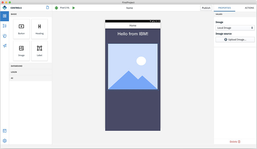
- Button - Buttons has a property to label. In the Action tab you can specify the page to navigate to on click of the Button.
- Heading Text - Helps you to add a heading text for the application such as Page Title.
- Image - Helps you upload a local image or provide a url of an image.
- Label - Helps you to add static text to your page body.
-
Databound - helps you to connect with a data set and operate on the entities in the data set. Databound consists of two components: List and Connected Labels
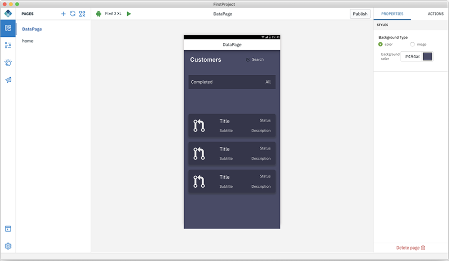
- List - Create a new page and drag and drop the List component. Add the List Title, Choose the list type to work on, Add content to work on, and select the dataset to use.
For more information on how to add Data set, refer here.
-
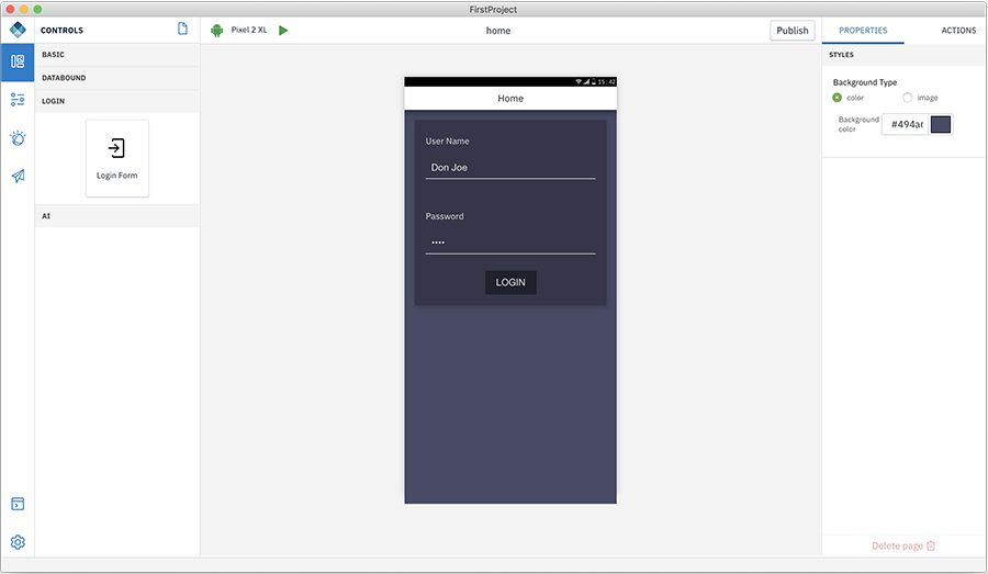
Login - Login consists of the Login Form control.
The Login Form control helps you to create a login page for your application to connect the user to the Mobile Foundation server. Mobile Foundation server provides a security framework to authenticate users and provide that security context to access the data sets. For more information read here.
For more information on how to add the Login Form control, refer here.
-
AI - AI controls allows you to add Watson AI capabilities to your app.
-
Watson Chat - This control provides a complete chat interface that can be powered with Watson Assistant service on IBM Cloud.
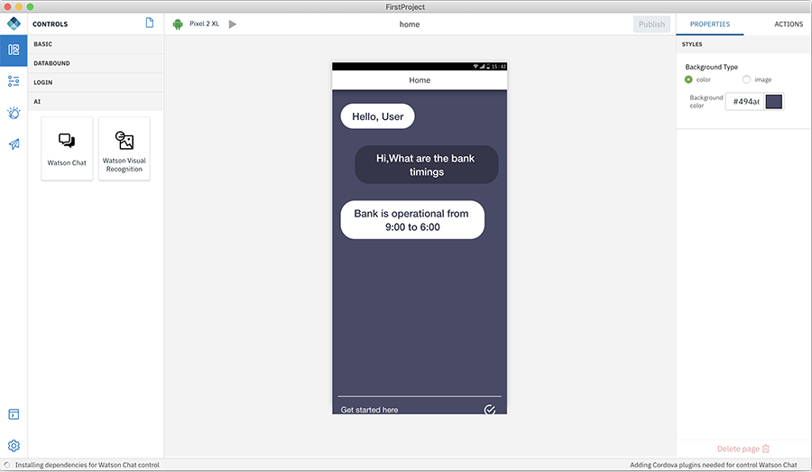
- In the properties section select the configured Watson Assistant service and select the Workspace you want to connect to. To define and train a Chat conversation see Chatbot under Watson.
-
Watson Visual Recognition - This control provides an ability to take a picture and have Watson Visual recognition service identify it for you.
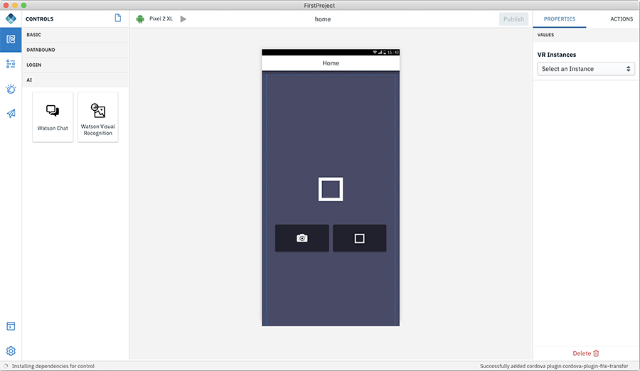
- In the properties section select the configured Visual Recognition service and the classification model. To define and train using your own images see Image recognition under Watson.
-
-
-
Canvas section - This area consists of the Current Channel selected, Current Page name, Publish, and Canvas.
- Channel icon - This displays the current channel selected. You can add additional channels by selecting the required channels in the Platforms section under Settings > App > App details.
- Current Page Name - Displays the canvas page name. When switched between pages, the current page name gets updated to the selected page.
- Build/Preview the app - This button has two options: a. helps to preview the app that you are developing; b. build the app.
- Publish - This option helps you to build and publish your app for Android/iOS to App Center or Publish Direct Updates of your app “over-the-air” with refreshed web resources.
- Canvas - At the centre of this section is the canvas which displays either the design or the code. You can drag-and-drop the controls and create the app.
-
Properties/Actions tab - At the right-hand side is the properties and action tab. When a control is placed in the canvas, you can edit and modify the properties of the control and connect a control with a related action to perform.
Data
You can create a Data set for a micro service and after creating the data set, you can connect the data bound controls in your app.
For more information on how to add Data set, refer here.
Watson
The Digital App Builder provides an ability to configure the app to connect to the various Watson services provisioned on IBM Cloud.
Engagement
You can add Push notifications to your app and increase user engagement or use Live Update feature to show/hide controls and pages or change their properties when your app is live.
Console
Helps you to view the code for each of the components. Also displays the information about various activities and errors.
Settings
Settings helps you to manage the app settings and rectify any errors during the build process. Settings consists of App details, Server, Plugins, and Repair Project tabs.
Digital App Builder interface in Code mode
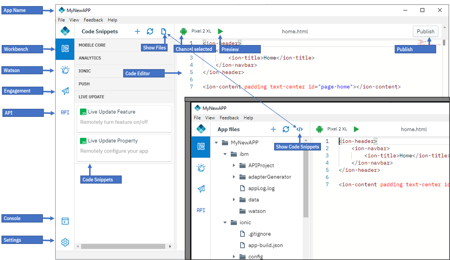
Digital App Builder interface in Code mode consists of the following in the Left navigation panel:
- Workbench - displays or hides the Files
- Watson - consists of Image Recognition and Chatbot (Watson Assistant) components for configuring an existing instance or create a new instance.
- Engagement - You can increase your user engagement with the app by adding Push notifications services and use Live Update feature to show/hide controls and pages or change their properties when your app is live.
- API - Helps to mock the server by just providing a JSON data during development.
- Console: displays the console to see the activities.
- Settings: displays the App details, Server info, Plugins, and Repair Project (like Rebuilding dependencies, Rebuilding platforms, Resetting IBM Cloud credentials), enable or disable analytics.
Workbench (Code mode)
Workbench helps you to design the pages. Workbench consists of two work areas:
- Project Files: This area displays the list of files associated with this app created by default. Use + sign to create a new page. On clicking Controls icon (</>), displays the Code Snippets panel. You can drag and drop these code snippets to your code and modify the properties of each of the controls selected.
Code Snippets (Code mode only)
Some of the commonly used Code Snippets are predefined and can be added to the source files by simple drag-and-drop from the Code Snippets section. This section consists of code snippets in the following categories:
- Mobile Core - Code snippets for performing basic operations with IBM Mobile Foundation Server
- Analytics - Code snippets for Custom Analytics, and User Feedback.
- Ionic - Code snippets for simple Ionic components.
- Push - Code snippets for working with Push Notifications.
- Live Update - Code snippets for working with Live Update for Feature toggle.
Inclusive terminology note: The Mobile First Platform team is making changes to support the IBM® initiative to replace racially biased and other discriminatory language in our code and content with more inclusive language. While IBM values the use of inclusive language, terms that are outside of IBM's direct influence are sometimes required for the sake of maintaining user understanding. As other industry leaders join IBM in embracing the use of inclusive language, IBM will continue to update the documentation to reflect those changes.